
When choosing tile and surface colors for your pool, consider color theory to create the perfect atmosphere. Blues and greens evoke calm and serenity, while darker shades add depth and sophistication. Complementary color schemes offer vibrant contrast, and analogous tones create a soothing, cohesive look. Keep lighting and surroundings in mind, as they affect how colors appear at different times of day. Exploring these principles further will help you design a stunning, personalized outdoor oasis.
Key Takeaways
- Use color psychology to select hues that evoke desired moods, such as calming blues or tranquil greens.
- Opt for complementary or analogous color schemes to create contrast or cohesion in pool design.
- Consider how tile colors interact with materials and surroundings to enhance water appearance and overall aesthetic.
- Incorporate lighting effects, both natural and artificial, to influence how colors are perceived at different times.
- Choose durable tile and surface colors that resist staining and fading, maintaining visual harmony over time.
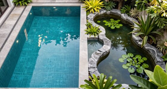
Have you ever wondered how color choices can transform a pool’s overall look and feel? When designing your pool, the colors you select for tiles and surfaces play a vital role in shaping its ambiance. Water color psychology reveals that different hues evoke specific emotions and perceptions—blues can be calming, greens suggest tranquility, and darker shades may add depth and sophistication. Understanding these psychological effects helps you choose colors that align with your desired atmosphere, whether you want a serene retreat or a lively gathering spot.
Color choices influence your pool’s mood—blues for calm, greens for tranquility, dark shades for elegance.
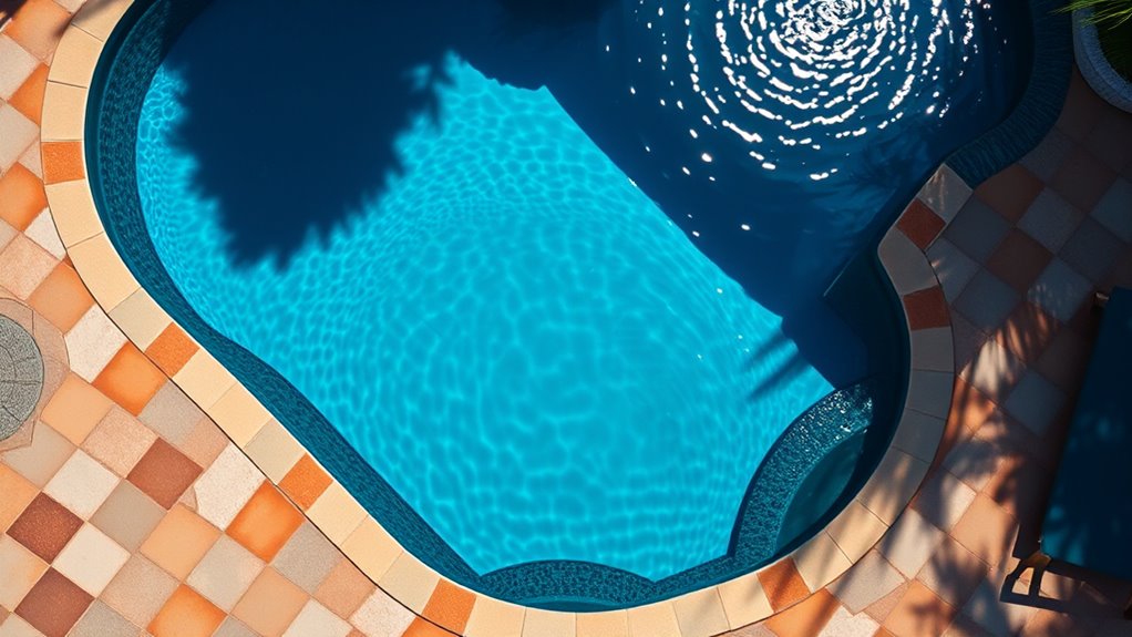
One effective way to make thoughtful color decisions is by considering complementary color schemes. These involve pairing colors opposite each other on the color wheel, like blue and orange or green and red. Combining complementary colors creates visual contrast and balance, making your pool stand out while maintaining harmony. For example, a pool with soft blue tiles contrasted by warm-toned deck surfaces or accents can draw attention to the water’s clarity and vibrancy. Conversely, incorporating analogous colors—those next to each other on the wheel, like blue and teal—can produce a more subtle, cohesive look that feels soothing and unified.
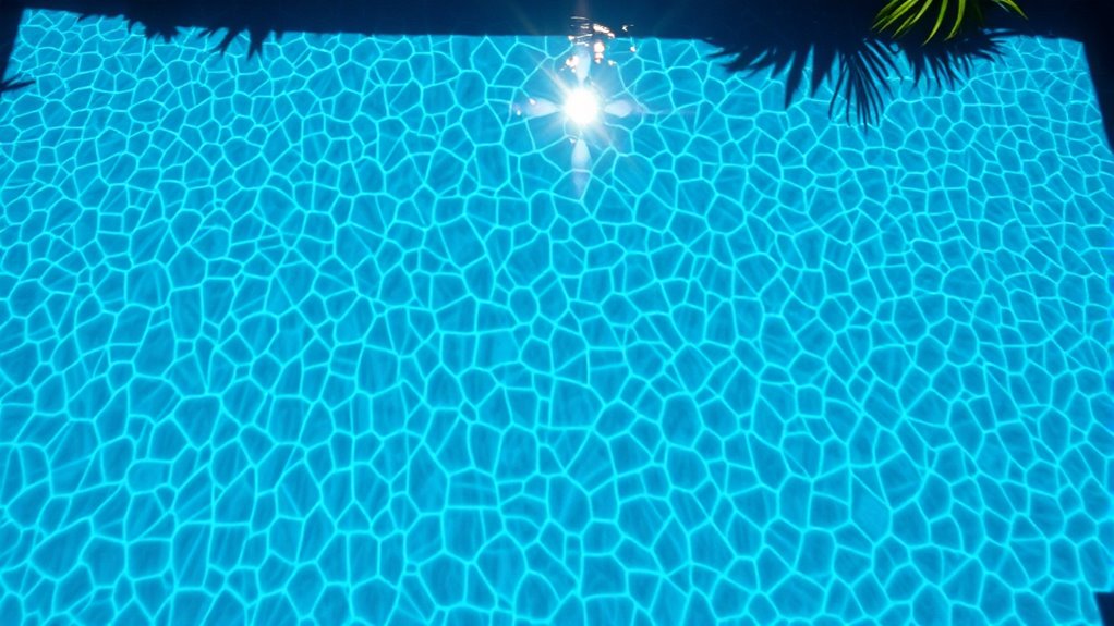
When choosing tile colors, think about how they will interact with your pool’s surroundings and lighting. Light-colored tiles, such as pale blues or whites, reflect natural light and make the water appear brighter and more inviting. Darker tiles, like navy or charcoal, create a sense of depth and sophistication, especially in larger or more modern pools. Surface materials, whether plaster, pebble, or quartz, also influence the overall color effect. For instance, a pebble finish in earthy tones can add texture and warmth, while a smooth plaster in cool blue shades emphasizes the water’s clarity.
Lighting plays a significant role in how colors are perceived at different times of day. Under natural sunlight, lighter colors tend to glow, enhancing a fresh, airy vibe. At night, with the right underwater lighting, darker hues can transform your pool into a mysterious, alluring space. By considering these factors, you guarantee that your color choices continue to look stunning across various lighting conditions.
In addition, understanding water quality factors can help you select colors that are more resistant to staining or discoloration, ensuring your pool maintains its beauty over time. Ultimately, your goal is to create a harmonious environment that reflects your style and enhances the pool experience. Whether you prefer tranquil blues, vibrant oranges, or subtle greens, understanding water color psychology and employing complementary color schemes empowers you to craft a customized, visually appealing pool. Your careful selection of tile and surface colors will set the tone for your outdoor oasis, making it a place where you can relax, entertain, and enjoy every moment.

E-Z Patch 3 Pool Tile Thinset Cement for Repairs – Color Adjustable Pool Tile Adhesive (1 lb)
Easy to Prepare Tile Adhesive – Just mix water & dry cement to start with your DIY tile…
As an affiliate, we earn on qualifying purchases.
As an affiliate, we earn on qualifying purchases.
Frequently Asked Questions
How Does Lighting Impact Color Perception in Pools?
Lighting effects considerably impact how you perceive pool colors. Bright lighting enhances color contrast, making tiles and surfaces appear more vibrant and dynamic. Soft or dim lighting can create a calming, subdued atmosphere, muting colors and blending surfaces into the surroundings. You should consider how lighting interacts with your pool’s colors to achieve your desired mood, ensuring the effects highlight your design choices and create an inviting, visually appealing space.
Are There Color Trends for Pool Tiles in 2024?
In 2024, the trending pool tile colors lean toward soothing blues, vibrant aquas, and earthy tones. You’ll find designers emphasizing color psychology, using calming shades to create relaxing atmospheres. Complementary color schemes are popular, pairing bold tiles with neutral surfaces for balance. These trends help you craft a visually appealing pool that promotes tranquility and visual interest, making your outdoor space both stylish and inviting.
How Do Color Choices Affect Pool Temperature?
You might think darker tiles cool down your pool, but ironically, they actually warm it through higher thermal absorption. Light-colored surfaces reflect sunlight, keeping water temperature lower, while darker hues absorb heat, raising water temperature. So, if you want a warmer swim, opt for deep tones; if you prefer a cooler dip, go for lighter shades. Your color choice directly influences water temperature, making your pool more comfortable year-round.
Can Color Theory Influence Pool Safety and Visibility?
Color theory can greatly influence pool safety and visibility. By using color contrast, you make key features like steps, edges, and depth markers stand out, which helps prevent accidents. Bright, contrasting colors serve as safety signaling, alerting swimmers and lifeguards to potential hazards. Choosing high-contrast tiles and surfaces ensures better visibility, making your pool safer for everyone and reducing the risk of slips or falls.
What Are Eco-Friendly Options for Pool Surface Colors?
Looking to be eco-friendly? You can opt for pool surface colors made from natural pigments or recycled materials. These options not only reduce environmental impact but also add unique, earthy tones to your pool. Imagine swimming in a surface that’s kind to the planet—no harmful chemicals, just sustainable style. So go ahead, choose a greener glow, and make your pool a true eco-champion without sacrificing beauty.

Gardencoin Outdoor Recessed LED Lights, Heavy Duty Soffit and Deck Lighting Flush Mount, 12-24V Low Voltage Landscape In Ground Well Light, Underwater Pond Light, Dimmable Widely Used, 6pack
New upgraded spring clamp: to cope with more usage scenarios, we have upgraded the clamp shape and length,…
As an affiliate, we earn on qualifying purchases.
As an affiliate, we earn on qualifying purchases.
Conclusion
By understanding color theory, you can create a pool that feels like a natural extension of your landscape, inviting relaxation and enjoyment. Choosing the right tile and surface colors is like painting a masterpiece—you set the mood and tone of your outdoor space. When you select colors thoughtfully, your pool becomes a tranquil oasis, much like a calm lake reflecting the sky. Let your choices transform your backyard into a vibrant, serene retreat you’ll love.

Pool Patch Underwater Pool Tile Adhesive (4 oz) – Waterproof Pool Tile Setting Paste – Professional Strength Adhesive for Ceramic, Mosaic & Stone – Works 100% Submerged, No Need to Drain Pool
REPAIR WITHOUT DRAINING: Save time, water, and chemical costs with a high performance formula specifically designed to bond…
As an affiliate, we earn on qualifying purchases.
As an affiliate, we earn on qualifying purchases.

SURAIELEC 12V AC Pool Lights for Inground Pool, 10 inch Color Changing LED Pool Light with Remote Control, 300W Equivalent, Underwater Swimming Pool Light Fixture for Large Wet Niches, 50FT
⚠️⚠️⚠️A Transformer is Required! -[Fits 10" Standard Niches]: Perfectly designed for 10 inch wet niches; easily replaces Pentair,…
As an affiliate, we earn on qualifying purchases.
As an affiliate, we earn on qualifying purchases.